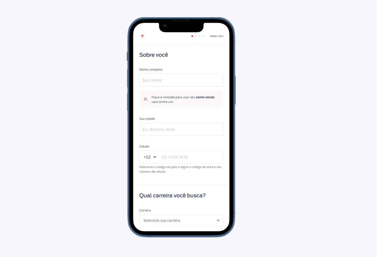
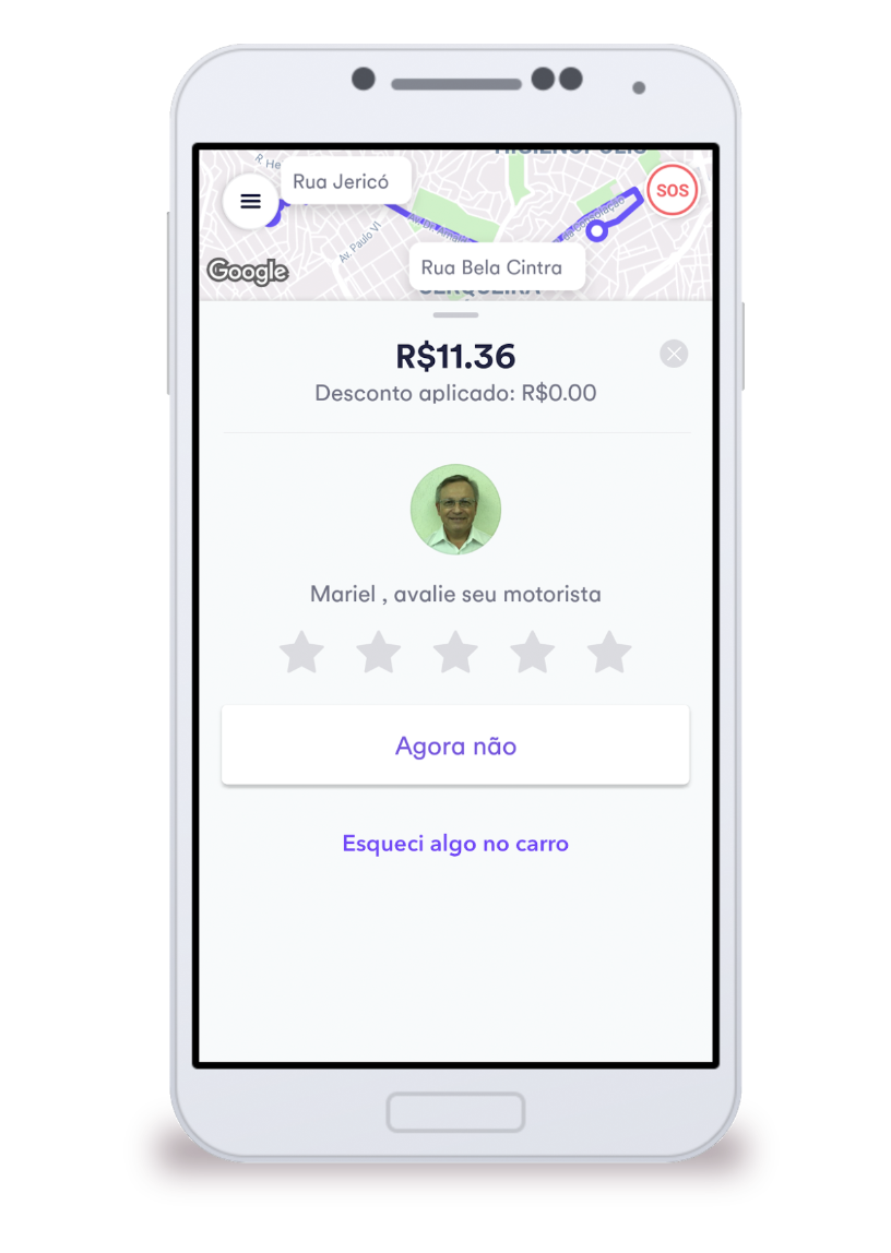
Work done in 2019.
Context & Problem
The merger of the companies that own the two largest Brazilian real estate portals brought about a challenge: how to maintain consistency in the products of the ZAP Imóveis and Viva Real brands, providing an opportunity for the teams to scale the products with agility.
In just a few months of working together, it was already possible to perceive that there were challenges both in the design chapter and in the technology aspect of redoing many elements while maintaining standards in product development.
This led to the solution of creating a design system by the Design team with developers. The two portals are very similar, with many visual elements being the same, only changing styles inherent to each brand, such as colors and typography.
For a year and a half, this design system, named Lina in honor of the architect Lina Bo Bardi, was developed as an unofficial initiative within the company. There was no dedicated team in building this product. People dedicated time and effort simply out of interest in building something that facilitated everyone’s work.
Myself, still working on the Owner’s squad, was one of the contributors to the design system.
And it was because of this delivery of value that, in a change in the company’s structure, the opportunity arose to formalize a team dedicated to the evolution of the design system, formed by me, a front-end developer and a technical leader.
Process
I designed a dynamic, with the collaboration of an agilist, and with the participation of product designers, front-ends and product managers to capture the pain of these people’s day-to-day work and so I created a roadmap and prioritized the product design system development backlog.
As a purpose for the newly created team, we defined the following objectives: people, processes and products, intending to create a team that could support the ZAP Group’s product teams, streamlining, scaling and creating visual consistency for the brands.
As OKR, we define two main objectives:
1. Provide clarity to stakeholders about their roles in the Design System processes:
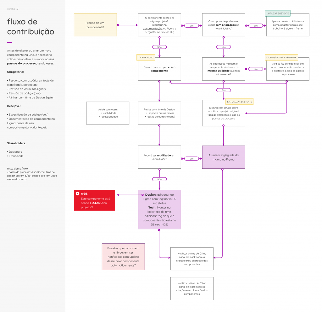
- Create processes for creating and changing components;
- Have these processes (creation and/or change of components) executed successfully in 99% of requests;
- Have an evaluation above grade 8 in NPS in the execution of design system processes.
2. Make the Design System available in a single, organized link, as a source of truth and disseminated throughout the company for consultation and interaction, which would have the lowest adoption impact
- Organize Lina 90% into groups such as: Iconography and styleguides of the brands Grupo ZAP, ZAP, Viva Real and Marketing;
- Reduce the impact on the loading time of a project that uses Lina by 35% (improved technical debt).
Solution
Documentation
I created a website to keep the design system documentation updated and accessible to people in the company, with an inventory and status of each component that allowed visibility and autonomy so that squads could work on their products more quickly and assertively:
https://zeroheight.com/522094462

ZAP Group brands in themes
For all 3 brands of the ZAP Group, I analyzed the tokens and components listed below and organized them into 3 styleguides according to the respective brand, so that we could create themes within the design system and thus facilitate the work of designers in the search for artifacts.
Colors: analysis of the color palette, creation of new colors according to accessibility and usability rules
Buttons: analysis of use in interfaces, nomenclature, definition of new standards for states and organization of components for coding
Typography: analysis of use in interfaces, definition of new standards
Components: maintenance of several larger components using the definition of smaller tokens: form elements, badge, avatar, card, tooltip, modal, pagination, etc.
Iconography
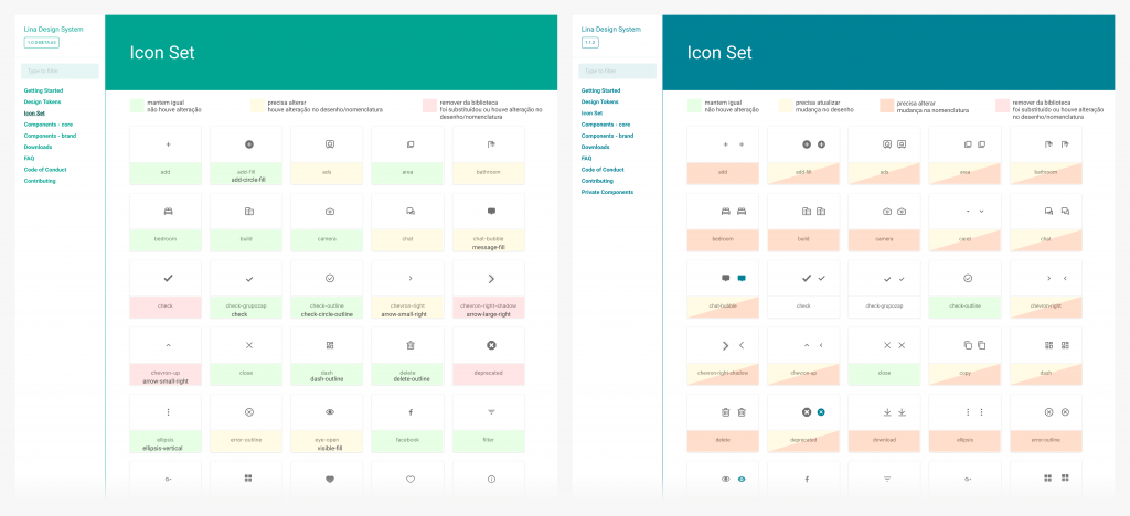
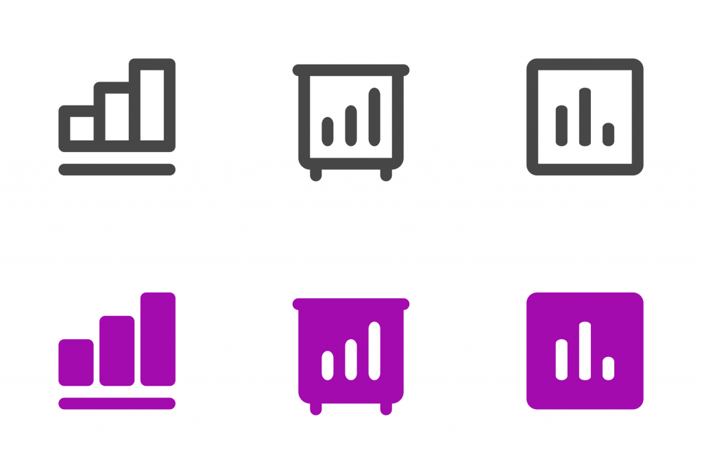
With the need for a family of icons (more than 60 items) and a considerably small team to create icons, we decided to use the same family from the Material Design library (Google) for all ZAP Group products and thus speed up the process. and visual consistency of products. I audited existing icons (removing, adding and changing), which resulted in the redesign of 60% of icons and the addition of new ones. A 285% increase in icons added to the library (open source).
Governance
I led the maintenance of the entire design system and became a reference for the team, monitoring the use of components in Grupo ZAP products with the Product Designers, suggesting improvements and changes, offering consultancy to these people in the construction of the interfaces they were working on and supporting products to scale in an organized way and with visual consistency.
Result
Based on the team’s objectives, I created meetings to align People, a space where we had total focus on the design system with rich discussions about visuals, interaction, animation, documentation and prioritization.
This generated Processes better defined and iterated every week, both for collaboration in creating new components and for autonomous changes.
The greatest evidence of the impact of the design system on the Product was in the creation of a new product for Rent, in which a new squad can test its first hypotheses in a few weeks using only tokens and components available in the Lina.
In my last quarter working in this squad I did the NPS survey again with product designers, front-ends, product managers and engineering managers (around 25 people) and we obtained an increase in the average score from 8 to 9.
