Context
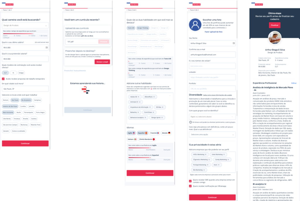
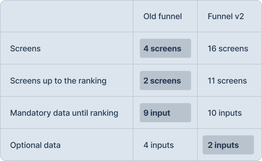
Revelo underwent a rebranding and the Design team during applying the new skin made modifications to the registration funnel for individuals seeking employment. This change expanded the funnel from 4 screens to 16 screens, prompting users to focus on completing each input. Unfortunately, no user testing was conducted before implementing this new flow into production.
Another issue raised was the necessity of implementing the design system, which already had some component improvements that could benefit code efficiency, page loading, and overall performance.
These alterations resulted in conversion problems, leading to a 25% decline, and the Growth team experienced the highest Customer Acquisition Cost (CAC) of the past year at $2,900.
The hypothesis is that the increase in screens (from 4 to 16) made the registration process much more time-consuming, leaving users without a clear sense of completion. Additionally, it was recognized that some components could be enhanced for both technical performance and usability.
- Re-branding
- Implementation of the design system
- Changing the registration flow
Problem (business analysis)
- Drop in conversion by 25%
- CAC: US$2,900
Hypothesis
The increase in steps in signup made the funnel time-consuming and users had no prospect of completion
Case
Comparing the old funnel to the v2 funnel in the context of Product Design, it becomes evident that completing a registration may seem more challenging for users when presented with numerous screens and lacking feedback on the remaining steps to reach the end.
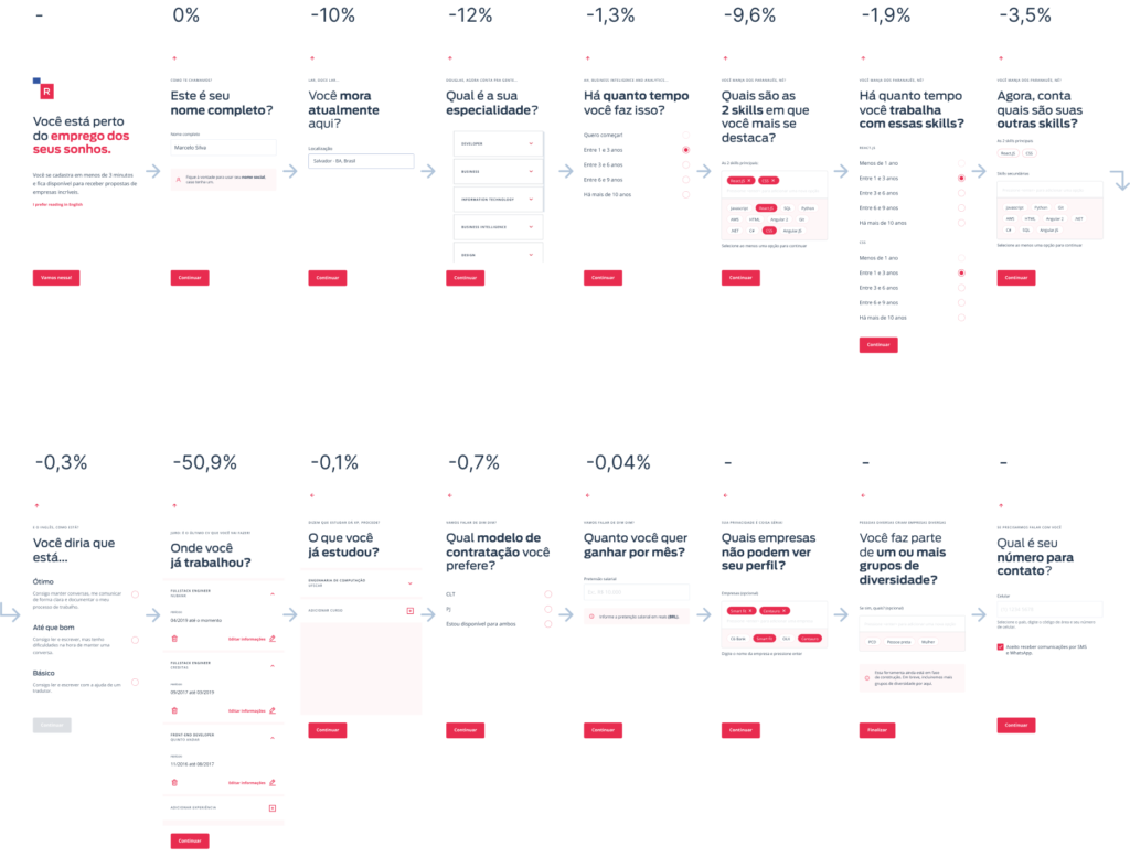
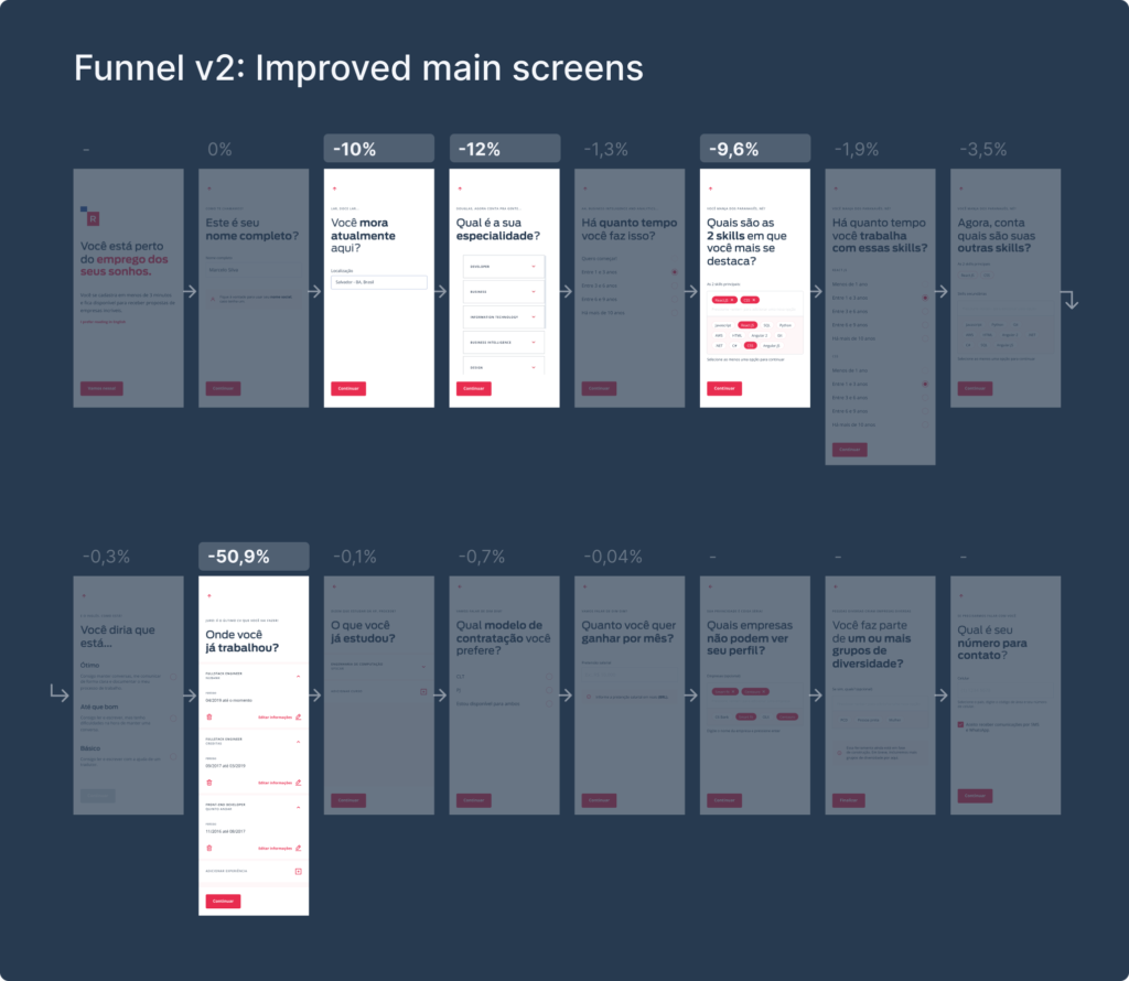
Below, you can see the 16 screens of the Funnel v2 with the conversion drop percentages.
The Skills (-9,6%) and Professional Experiences (-50,9%) screens have the highest drop rates and are the ones requesting the user’s most crucial information for Revelo to rank the registered user and make a match with open positions.
Additionally, it’s noticeable that users were making fewer clicks to progress through the funnel stages.
Growth analysis
Conversion of ranked candidates with complete profiles is worse:
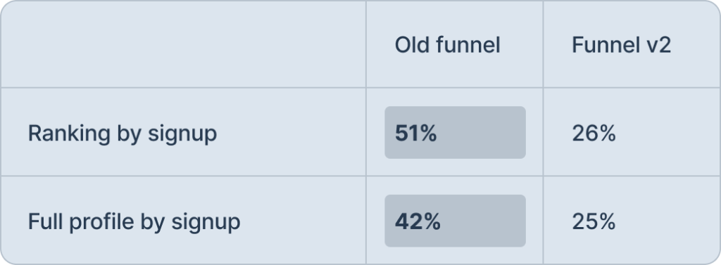
Information to achieve the business rule is worse:
Defining what would be worked on
UX Writing
- Apply brand tone of voice
- Improve long storytelling
Usability
- Information Architecture: reorder questions and input texts
- Remove internal scrolling that makes viewing and filling efficiency difficult
- Implement filling in with LinkedIn parser removing difficulty filling out professional experience manually (satisfaction)
- Efficiency in interaction and performance with Location search component
Mapping solutions
It was necessary to strategize on how to implement all these solutions swiftly, aiming to change the game as quickly as possible. We prioritized addressing the most critical issues and focused on what could be developed rapidly. Working closely with the Product Manager, we versioned the following releases:
- Versioning 1:
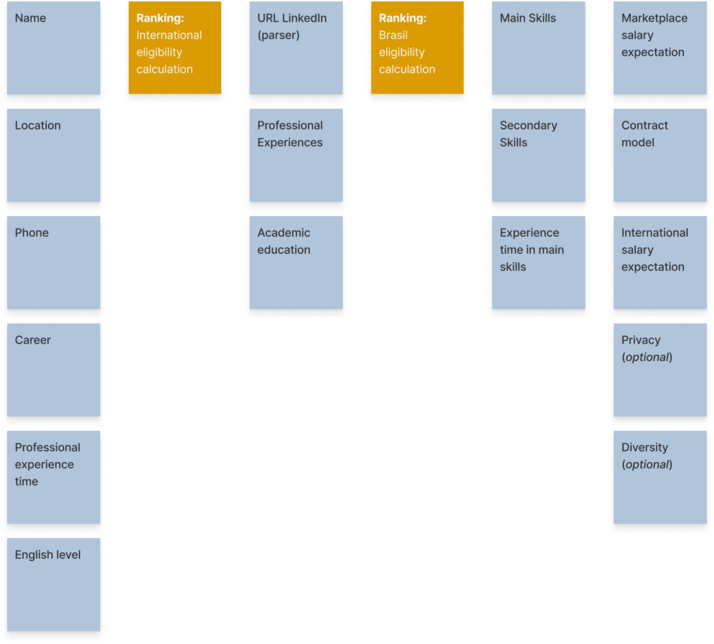
- Consider Ranking as a guide for business rules in creating a useful profile.
- Regroup information collection to enhance information architecture and classification.
- Improve UX Writing.
- Enhance predictability of completeness with a stepper.
- Versioning 2:
- Complete LinkedIn profile information (photo, professional experiences, and description).
- Utilize the Design System for improved component performance and usability.
- Versioning 3:
- Revise the process of filling out Professional Experiences, linking them with selected skills.
- Mirror information filled in during profile editing.
- Create and improve components as needed.
Usability testing
Check out the usability test prototype used for evaluation. The assigned task to participants was simple: create your profile on Revelo. The objective was to understand whether people perceived the registration process as time-consuming and challenging, both in terms of component usability and completing professional experiences.
Summary
5 users with existing registrations on Revelo
4 users who had never accessed the funnel before
All users were developers
- Overall, users mentioned that the registration process was quick. They did not doubt while navigating the prototype and understood the objectives of the questions.
- 2 users who had previously registered commented on the manual filling process.
- 8 users filled in the skills section without difficulty.
Insights for the future
- Salary calculator: monthly vs. annual. Some users from Latin countries culturally prefer the monthly salary calculation.
- The Phone component was mentioned by some users, leading to an improvement in the design system.
UI changes
Simple interface
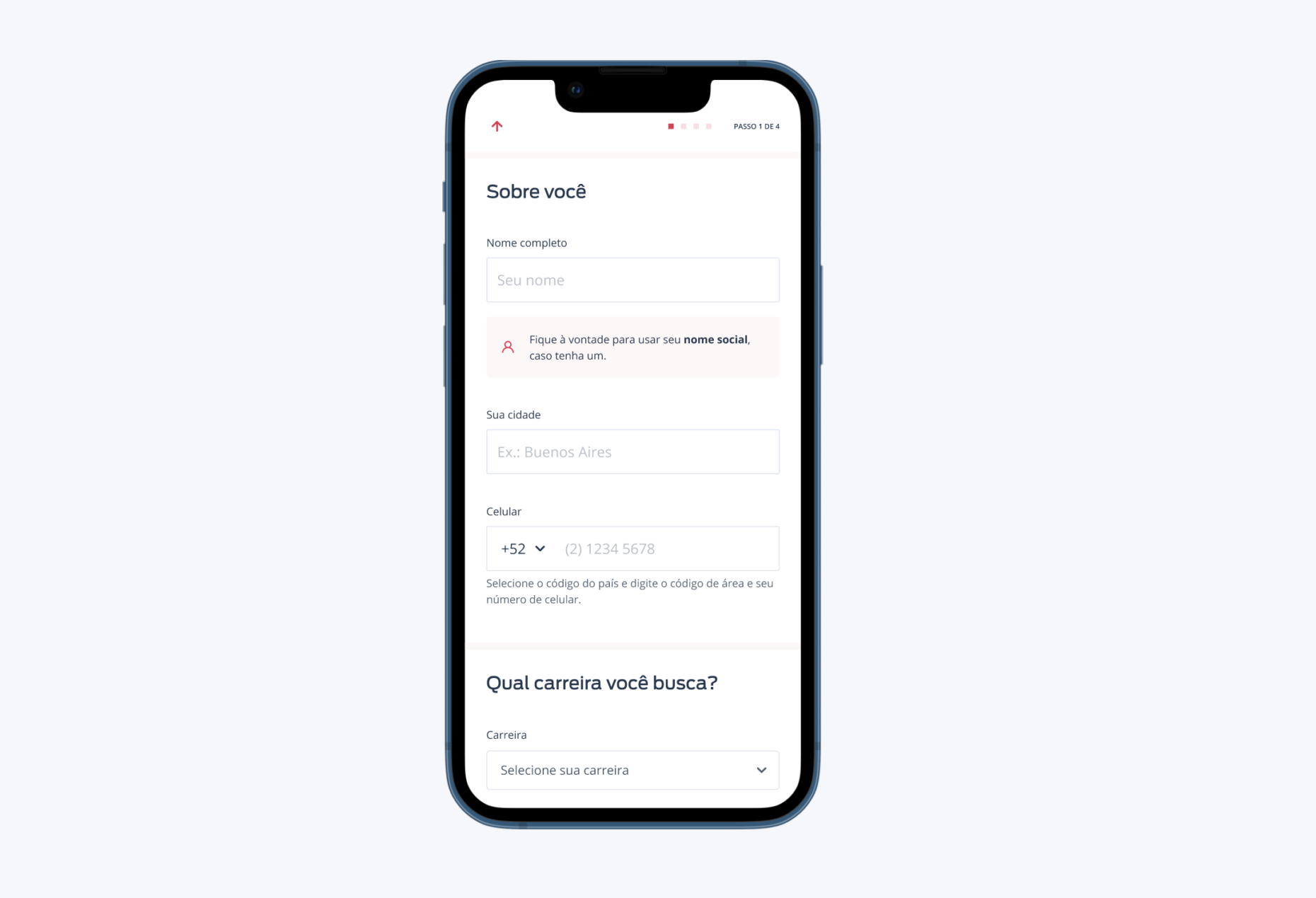
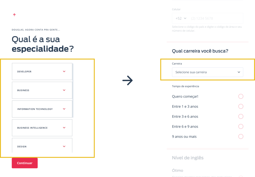
A component that caused scrolling on the user’s screen and ended up hiding important fields has been replaced with a simple standard select. Sometimes, less is more.
Information Architecture
Three text fields across three different screens required users to make three clicks. Why not consolidate them onto a single screen?
The Location component underwent improvement by the development team. After sharing Hotjar videos depicting users struggling to find cities due to non-alphabetical order or mixing with countries Revelo doesn’t recruit from, we cleaned up the autocomplete results for organized and user-friendly input.
During this enhancement, I also took the opportunity to improve the Phone number field. The internal recruitment team raised concerns about being unable to contact candidates due to incorrect phone numbers, especially considering many users are from different countries. This component resolved the issue, ensuring accurate phone numbers with clear guidelines on country code input. Since implementing this, we have not encountered any further problems with incorrect numbers 🏆.
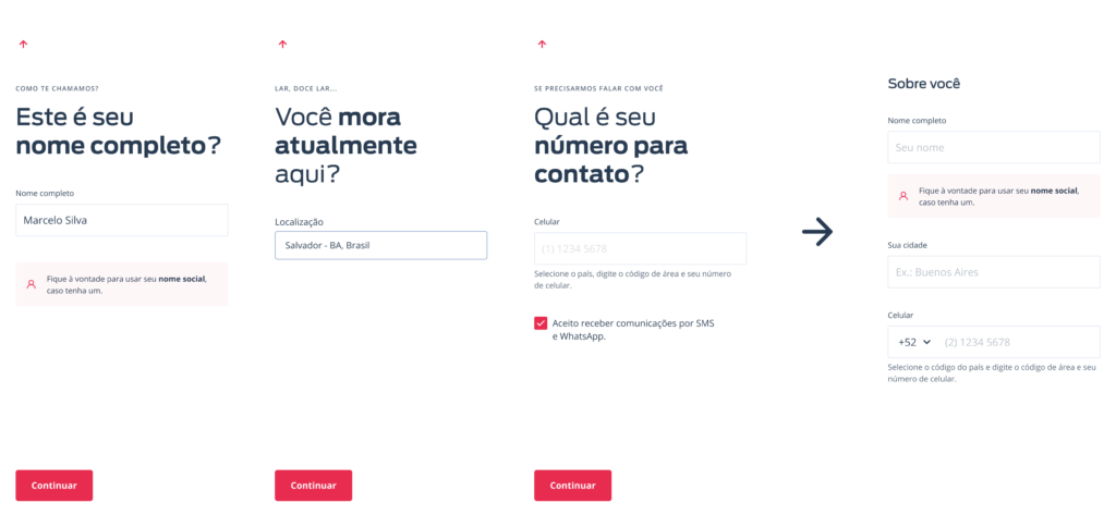
Step decrease and component improvement
The Skill component gathered crucial information, but it was challenging for users to understand. With a robust benchmark and insights into how other players retrieved this information, we aimed to avoid creating a new component from scratch. Instead, I designed improvements for the existing component, providing feedback to users that they could only select two primary skills and then specify their experience level in each.
This change enhanced the listing of candidates and improved how they were filtered in the recruitment team’s search results.
Feature with LinkedIn API
For this component, during a conversation with one of the developers on the team, I learned about the existence of a LinkedIn API that could recognize a user’s profile and fetch all the information into Revelo with just one click. It would be magical to address a 50% drop on a screen!
The team decided to conduct a Proof of Concept (POC) to test this functionality, and it worked! We successfully tackled a problem that was frustrating for users: the need to manually input their professional experiences was no longer necessary. A single click now imported their entire work history into Revelo.
Was it success?
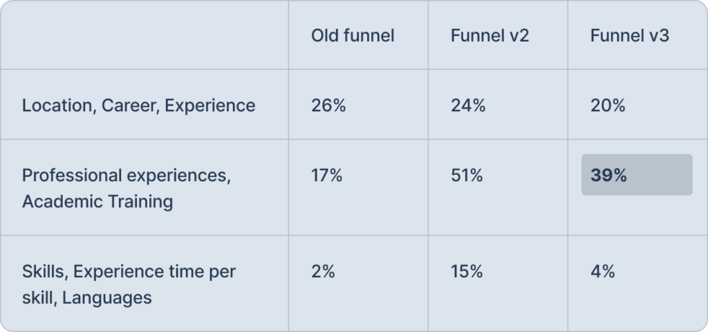
Some conversions did not return to their previous level because through interviews with stakeholders I discovered that it was more important to have better information about professional experiences.
Change in company strategy: candidate liquidity for Brazilian companies was healthy, so it made sense to enrich profiles for American companies.
With more enriched profiles, we help the internal recruitment team with less time to create a shortlist.
Short term
- CAC: ~85% ↓
- Before US$2,900 → After US$480
- Improved page loading performance
Goals throughout the quarter
- Translation into English and Spanish
- Mirror information requested when registering for profile editing
- Reference for implementing the flow in the app
- Creation of 6 new components (experience time, language selection, autocomplete for skill selection and phone DDI, avatar upload, salary calculator)
