
Context
I joined the company one month before the merger of the largest real estate portals: ZAP Imóveis and Viva Real. This new company needed to integrate the systems of both websites.
Several stakeholders within the ZAP Group believed that the product sold to property owners for advertising on ZAP Imóveis alone could generate double the revenue if also marketed on the Viva Real portal.
1. Listing Creation
Problem
At that time, the ZAP Imóveis system was outdated and presented various technical challenges: it was not easy to conduct tests, add or remove new features. Additionally, selling and publishing a listing on two different portals was impractical, preventing the validation of the hypothesis to double the revenue.
Moreover, the pages lacked responsiveness, and the mobile usability made filling out the property registration a daunting task, as evidenced by user complaints. The metric related to unique users showed that 60% of accesses to this funnel were made through mobile devices and 40% through desktop.
For all these reasons, the initiative arose to rebuild outdated and rigid code to increase the conversion of the funnel.
Process
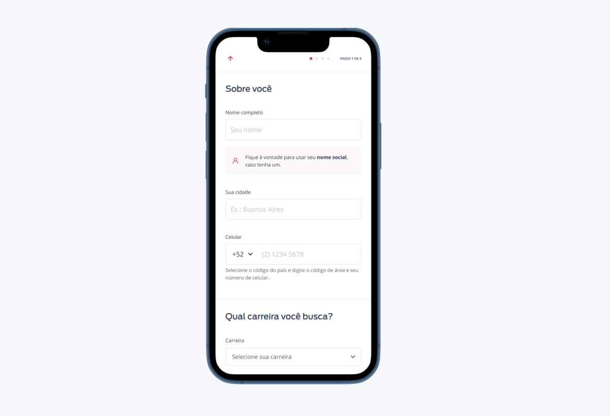
As the property registration flow was not monitored (Google Analytics), I planned to start with a redesign of the screens, maintaining the same flow of steps that already existed so that we could have a database and iterate from there with the various hypotheses that were accumulated, aiming for improvements in conversion, revenue, and usability.
This was a learning moment about how the still small Design System available needed to scale and assist the company in this new phase. I used the few components that had been created and started with this project as version 2.0. In this other post, I talk about my leadership in the design system of the ZAP Group that started from this squad.
I took this opportunity to adjust and create accessibility rules for these components:
- some grays were not legible
- interaction in text fields did not provide feedback errors
- size of text fields and fonts was too small
- vertical and horizontal spacing
I also reconsidered the usability of these pages by redesigning components such as:
- credit card and boleto payment module
- interaction of insertion, editing, and removal of photos component
- text fields with auto-complete
- and removing “bad ux” from an old system.
This work brought me the opportunity to work directly with significant revenue for the company and the learning of many business rules aligned with a diversity of stakeholders like: marketing, finance, sales, legal, customer service, as well as other teams that were also impacted by the information exchanged between systems (APIs).
Solution
View images of the interfaces designed for mobile:
Mobile: Funnel – Step 1
Mobile: Funnel – Step 2
Mobile: Funnel – Step 3
Mobile: Funnel – Step 4
View images of the interfaces designed for desktop:
Desktop: Funnel – Step 1
Desktop: Funnel – Step 2
Desktop: Funnel – Step 3
Desktop: Funnel – Step 4
Results
With the new stack, this entire flow began to be monitored via Google Analytics and Hotjar, making it possible to identify usability problems that users were facing and make adjustments.
User tracking in the funnel through the Hotjar tool provided visibility into user behavior. For example, I identified a serious problem during payment that only allowed the loading of the credit card component if there was a response from the Adyen servers (credit card operator).
This new funnel was designed in a modular way, allowing flow tests for product iteration, such as reversing the login step, completing the flow in a single step, and breaking down the flow step by step.
One of the biggest impact gains for the company was retiring a legacy system and the possibility of merging database and financial stacks.
The initial hypothesis of doubling the revenue was not validated. We had only 15% increase in revenue from owners originating from the Viva Real website. The significant gain was the innovation of stacks and organization of the finance department, in addition to usability improvements.

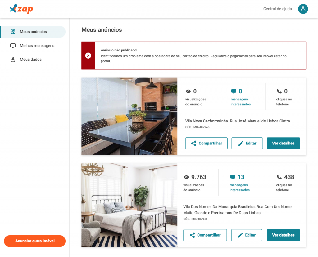
2. Listing Management
Problem
After creating the listing, the user’s journey continues in the logged-in area, where it should be possible to monitor the ad’s performance with messages received from people interested in the property, edit, and renew the contracted plan.
As it was not a responsive session, users had a lot of difficulty finding what they were looking for to complete their tasks, problems I found in periodic research results sent to customers.
There was also no event tracking, so we could not metricize the use of these pages.
Process
With the team, I suggested a plan to develop this redesign initially for mobile. I wanted to bring to users the visualization of the listing’s performance: how many times the property ad was viewed, how many messages received, and how many times people interested in the property clicked on the phone. The opportunity behind these numbers was to later provide more information about the listing’s quality (description, photos, checklist) and pricing.

So, with the screens designed and a high-fidelity prototype, I conducted usability tests with property owners’ clients who had already advertised on ZAP Imóveis, seeking to understand if they could:
1. Receive feedback from the system and view the listing created
2. Edit and delete the listing
3. View and respond to a received message
4. Renew the payment for the expired listing plan
As this journey would be on the web (and not in the app), it would be ideal to conduct tests with Android and iOS users to understand if they would have many difficulties with the navigation flow and understanding of information.
An interesting discovery from the feedback of this test, in addition to the validation of 90% of the above questions, was the need to adjust the design of the listing sharing icon. In the prototype, I used the default Android icon, and iOS users had difficulty recognizing what that icon meant. I defined with the front-end developer that the respective icon of each platform should be shown when the page is loaded (like Twitter do 😉).
I also identified difficulties for users to find where they could edit their profiles, and in a new initiative, I redesigned a new information architecture and screens related to the user and client account. This redesign was accelerated in an internal event (Hackweek) with the collaboration of other designers, and the construction of these screens was scaled to the entire logged-in area of ZAP Imóveis, also impacting the team responsible for users/tenants who rent properties.
Results
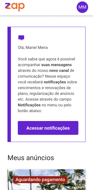
We phased the migration of clients from the old stack to this new stack, allowing only 30% of clients to access the new system initially to monitor for user experience issues and especially technical payment problems. In 2 weeks, we transitioned to 100% of the client base without bugs 🎉.
There was a risk that the revenue from listings renewals would be lost, but after the total migration of clients, the automatic renewal of listings by property owners was maintained, resulting in revenue of approximately R$ 360,000.

Deixe um comentário